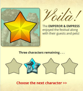
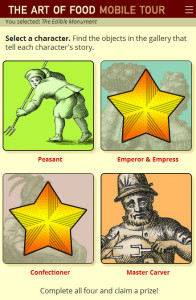
As I posted last week, in addition to launching the Art of Food Mobile Tour, we also went live with #GettyInspired.
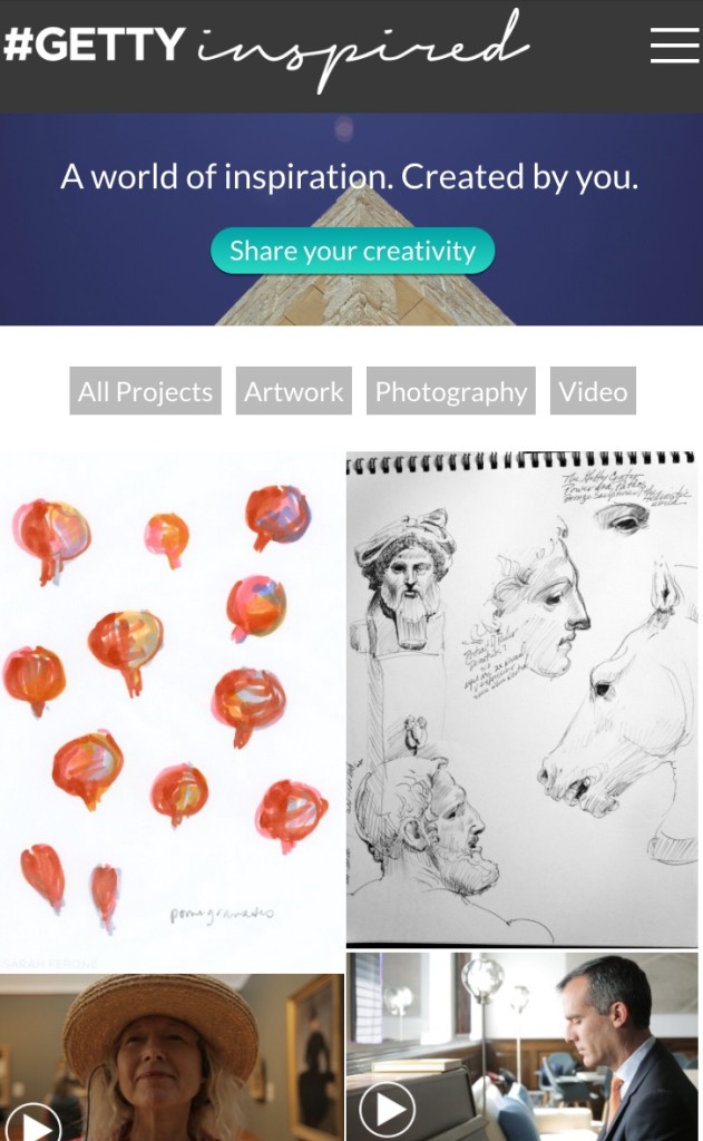
Spearheaded by my colleagues Annelisa, Sarah, Christopher and Mikaela, #GettyInspired is a place for the general public to share both their art and their views on what about the Getty (Center and/or Villa) inspires them. It is seriously cool in that it’s possibly the first time we’ve ever had something this big that features about 90% user-submitted content.
It was a project with a fast turnaround, so a lot of the development process is a blur, but I’m very pleased with the (almost) finished product. It looks like a simplistic site, but it really, really wasn’t. The project initially landed on my plate in August, after the previous developer left us for the corporate world, but I probably spent about three or four solid weeks actually on the ground, doing the building, working on very little else.
I knew from the beginning that we were going to build it in WordPress, but I spent precious time looking for a theme that might already have the functionality we were looking for—user-submitted posts that didn’t require a login; filterable image grid of posts for every page, with upvoted posts floating to the top; full-width header areas that could be images, videos or slideshows, as needed. Eventually I gave up and went with a free theme (Hatch) that I decided to use entirely based on its built-in function of listing all the posts on the home page in a grid of featured images.
Funnily enough, it turned out to be a pointless decision because to this day, I still have not figured out what function the theme is calling on to do that. Why is that important? Because I had to recreate that effect on every individual post page, and since I couldn’t figure out how the home page was doing it, I had to find a different solution for it anyway.
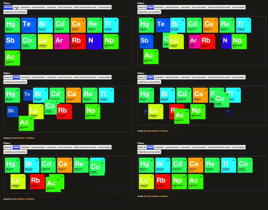
That problem was solved with Playing with columns—stacking posts in a grid and the Isotope plugin.
(I realized later that I could’ve just used Isotope by itself, but I didn’t have time to go back and recode it. S’ok, they still work well together. But Isotope totally rocks, and if you’ve never used it, take a few minutes to go check it out, it’s a fun plugin to play with.)
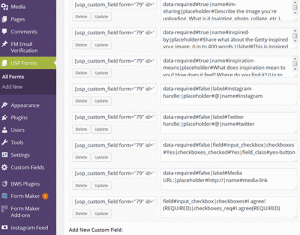
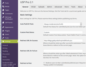 Then there was the requirement that the site enabled users to submit posts without needing a log-in/account, so the editors wouldn’t have to spend their days cutting and pasting into the WordPress back-end. For that I picked the USP Pro from Plugin Planet. Because it was so customizable, the learning curve was a little steep, but the support response was excellent (except for the very different timezones—I’m assuming the developer lives in Europe). Thanks to USP, visitors can fill out the online form and upload an image, and the content is automatically transferred to a WordPress post that is saved as a draft, needing only to be approved and published by one of the team’s editors. The editors can add an aside box for either a pull-quote or a related information link, and they can make a post “sticky” so it appears at the top of the post grid, but otherwise they rarely make any edits to the actual submitted content. (Any typos are not ours, people!)
The stakeholders also wanted a feed for the Instagram page. Annelisa found the perfect plugin for that—Instagram Feed from Smashballoon. Its single best feature, IMO, is the ability to block individual posts from appearing in the feed, to prevent spamming and keep truly offensive material from the page.
Setting the header image for each post page to be the user’s submitted image was pretty easy—using featured images is common in WP, so finding the right php calls was a cinch—but setting playable videos in that spot was a lot harder. It took at least half a day to find the right WP hook to return the string I needed, the correct php functions to display the video properly, and the right way to add the attributes to repress video titles and related videos. (Syntax errors will someday be the death of me!) Based on the difficulties of adding videos as headers, I assumed adding slideshows would be just as aggravating, so I put it off, but it turned out to be easy-peasy in the end. With all the heavy-lifting I’d already done for the videos, the code for the slideshows took mere minutes. (Yay for unexpected easiness!)
And that was really the main benefit of all the lines of custom code I had to add to the theme templates (which no longer resemble Hatch at all)—I learned enough in the laborious and frustrating beginning days to make the end stuff so much easier. I used PHP so the template knows whether the post originated from the USP form or from the WP back-end—it displays the content accordingly, and the editors can easily create custom posts that don’t have to follow the same format as the user-submitted posts. There’s jQuery in there to add those silly red asterisks to the required fields in the submission form (oddly one of the few things the plugin didn’t include); to change the padding to posts if they have an aside box; and even to replace any links hard-coded for our blog server (damned URL masking–an unexpected issue that totally broke things once the masking was activated the night before launch). And there’s a ton of custom CSS for every padding, margin, placement, and color.
It’s not finished, though, and there are still coding challenges. As I mentioned above, the stakeholders want users to be able to “up-vote” posts, and I have no clue how I’m going to do that. Right now I’m working on what will happen when we have too many posts to reasonably load up front. Pagination won’t work, because the filters at the top will only filter what’s actually on the page. Now I’m researching the “load more” feature that we’re all familiar with from other pages (most notably, Facebook). Will the filters still be limited to only those posts that are already on the page? Dunno yet, I gotta test that out. And if that doesn’t work, I’ll go back to the Isotope documentation (the filters are an Isotope feature) and see if there’s a way around it there. *fingers are crossed*
So that’s #GettyInspired.
I couldn’t have done it without Google, and I have no idea how *anything* got done before the Internet. Seriously.

